Design update | Please welcome, the new Virusdie design code for the next 5 years is here!
Dear Virusdie clients and partners! That was the long way – more than 6 years with the old design code for Virusdie environment, landing pages, materials and Virusdie graphic user interface. The old design code started with the simplicity in mind that let us keep user interfaces clear and intuitive. And the same time, now you need more features, and we can’t support all we want to share with you, just due to old user interface design. If we add new features on the old interface, that makes interaction with Virusdie inconvenient and not fluent. And that takes the simplicity in use right out of Virusdie. So we have to update the GUI for you. And even more – we have to update all the design code for Virusdie ecosystem completely! Cos that should be more simple and lite, and flat and modern first, to let us build the new user interface for you! And we started with the all brand new set of Virusdie landing pages, to represent you the new Virusdie design code approach for the next 5 years from now. And that is the very design code we’re going to use to rethink all Virusdie interfaces for your right this year. Entirely! So please welcome, the new Virusdie landing pages!
——–
What is the difference between old and new design code?
The thing is that is completely new. Our goal for all what we do – to make complex things simple. And that is really hard work – that is 100x harder in average to keep all clear and simple, rather than just add more and more info or details or features.
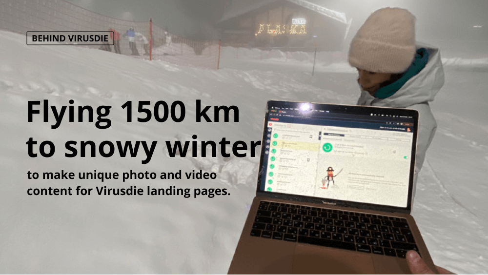
To let it looks always on top and keep first sight interaction clear, we used to implement a Huge Graphic Area design for our new landing pages. A media set made with special custom Photo and Video to show you how Virusdie really works. And Virusdie team made a 2000 km flight from one of the offices to make a photoset and video-set for new landing! ‘cos we believe, stock photo or illustrations – are the thing everyone can get. We dreamed about something beyond of standard approaches for design for web-services. And all of that now, yours! In frond of your eye! π
Now for landing product pages, like Tools, frames are separated for each very feature you need to know with a per-screen scroll (per feature scroll) to hold just main info on each your screen! For other pages a standard scroll used. We used blur to let your feel that pages have some weight and that is not just a primitive flat design. So many new tiny details, photos, and new landing structure to let your get more info in a simplest way ever possible!
That is all new Virusdie design code. We add more and more new landing pages each day, so you may feel how Virusdie changing in real time! And you already can start with the visit of new main page available: The brand new Virusdie landing pages. Please make sure your browser’ cache cleaned first.
P.S.
You probably may find that some of new pages are blank, during the navigation. That is ‘cos we’re working on the content and finish soon! The next thing where we’re going to implement the new design code – the new Virusdie graphic user interface and the Marketplace, and the plugin for WordPress! All coming in 2021!
———
Join our private Facebook group to get help from other security experts, and share your own web security experiences and expertise. Group members receive exclusive news and offers. They can also communicate directly with the Virusdie team. Join us on Facebook.